Typography and Colour: The Secrets to Effective Design?
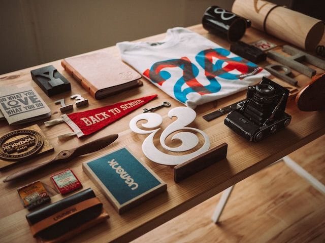
Photo by Jeff Sheldon @ unsplash
In the design world, digital 3D models often steal the spotlight, given their vivid realism and intricate detailing. Here shift your focus to two critical yet somewhat underrated aspects of design - typography and colour. It's easy to dismiss them as mere garnishing, but when leveraged appropriately, they can transform a design, lending it a character of its own. Here's how.
Typography: More than just Letters
At its core, typography is the art of arranging type to make written language legible, readable, and appealing. But dig a little deeper, and one finds that it plays a crucial role in communication, subtly influencing how the audience perceives the information.
Explore: What Custom Labels Can Do For Your Brand
The choice of typeface, for instance, can speak volumes about the brand or message. A modern, clean font might signal a tech-savvy, forward-thinking entity, while a handwritten-style font could indicate creativity and warmth.
Similarly, the type's size, weight, and spacing can affect readability and hierarchy, guiding the viewer's eye through the design. In essence, typography is a tool that designers use to present information and convey mood, tone, and brand personality.
Colour: The Silent Communicator
Just like typography, colour is another potent design element. The psychology of colour tells you that different colours and their combinations can evoke a spectrum of emotions, influence perceptions, and even prompt actions. For example, blue signifies trust and stability, while red symbolizes passion or urgency.

Beyond its emotional implications, colour also aids in functionality. By applying the principles of colour theory, designers can create harmony, establish visual hierarchy, and guide viewer attention. The right colour palette can enhance legibility, indicate interactive elements, and distinguish important information, making the design aesthetically pleasing and user-friendly.
When brands consistently use specific colours in their logo, marketing materials, and product packaging, those colours become associated with the brand. As a result, consumers can recognise and identify the brand even without seeing its name explicitly.
Supplementary reading: The Hallmark Of A Good Brand
With Adobe professionals, “Explore colour, texture and movement for any fabric.”
Creating a Cohesive Experience
While typography and colour hold their ground individually, their real power lies in their interaction. A harmonious blend of both can create a cohesive, balanced design that resonates with the intended audience. For instance, high contrast between text and background colour can enhance readability, while complementary typography and colour schemes can evoke a specific mood or theme.
Common Pitfalls to Avoid
Despite their potential, typography and colour can backfire if not used judiciously. Overloading a design with too many fonts or colours can make it look chaotic and confusing. Similarly, choosing trendy options without considering their relevance to the message or audience can lead to a design that feels inauthentic or out of place. As a rule of thumb, simplicity, consistency, and purpose should guide decisions related to typography and colour.
The Power Duo in Action
Consider a website design, for example. The typography could establish a clear hierarchy with the brand name in a large, distinctive typeface, the main menu in a smaller but bold font, and the body text in a simple, readable style.
The colour scheme, informed by the brand's identity, could use a dominant colour for critical elements like the logo and call-to-action buttons, a secondary colour for less important elements, and a background colour that supports the legibility of the text.

Read more: Raising The Bar On Creativity
While digital 3D models and other advanced tools often grab the limelight, fundamental design elements like typography and colour shouldn't be underestimated. When wielded correctly, they can enhance communication, influence audience reactions, and contribute to a design that is both visually striking and effectively functional.
Be sure to check out the media below:
Leaderonomics.com is an advertisement-free website. Your continuous support and trust in us allow us to curate, deliver and upkeep the maintenance of our website. When you support us, you enable millions to continue reading for free on our website. Will you give it today? Click here to support us.

Functional
Tags: Brain Bulletin, Business Management, Consultant Corner
Malena Morgan is a freelance writer who offers ghostwriting, copywriting, and blogging services. She works closely with B2C and B2B businesses providing digital marketing content that gains social media attention and increases their search engine visibility.